A hypothetical redesign of the marketplace app to improve buy and sell experience.
User Research, Product Design, User Testing
Adobe XD, Illustrator, After Effects
Individual Project
3 months, School project
This redesign project started with user observation and research on those who frequently use OfferUp and/or other platforms to buy and sell used goods online. These user insights set a solid foundation for the new interface. The goal of this redesign proposal is to improve the buying and selling experience and thus, encourage users to be more active on OfferUp.
OfferUp is one of the largest mobile marketplace for local buyers and sellers. Users can list and browse items easily and securely through reputation, safety, and messaging features. I've been actively buying and selling used products online since college. After using OfferUp, I noticed some design changes that would greately enhance my experience and I wondered if others felt the same.
While OfferUp provides specific features to ensure a safe marketplace experience, users still face difficulties in finding a used product. It takes them a great deal of time to discover and decide on a product that matches their price range and expectation. The reason for this is the lack of detailed description and photos that accurately show the condition of the product.
I redesigned the OfferUp iOS app to have more efficient and intuitive browsing and listing process. My goal is for users to have a consistent and delightful experience as both a buyer and seller, which will create a marketplace of options.
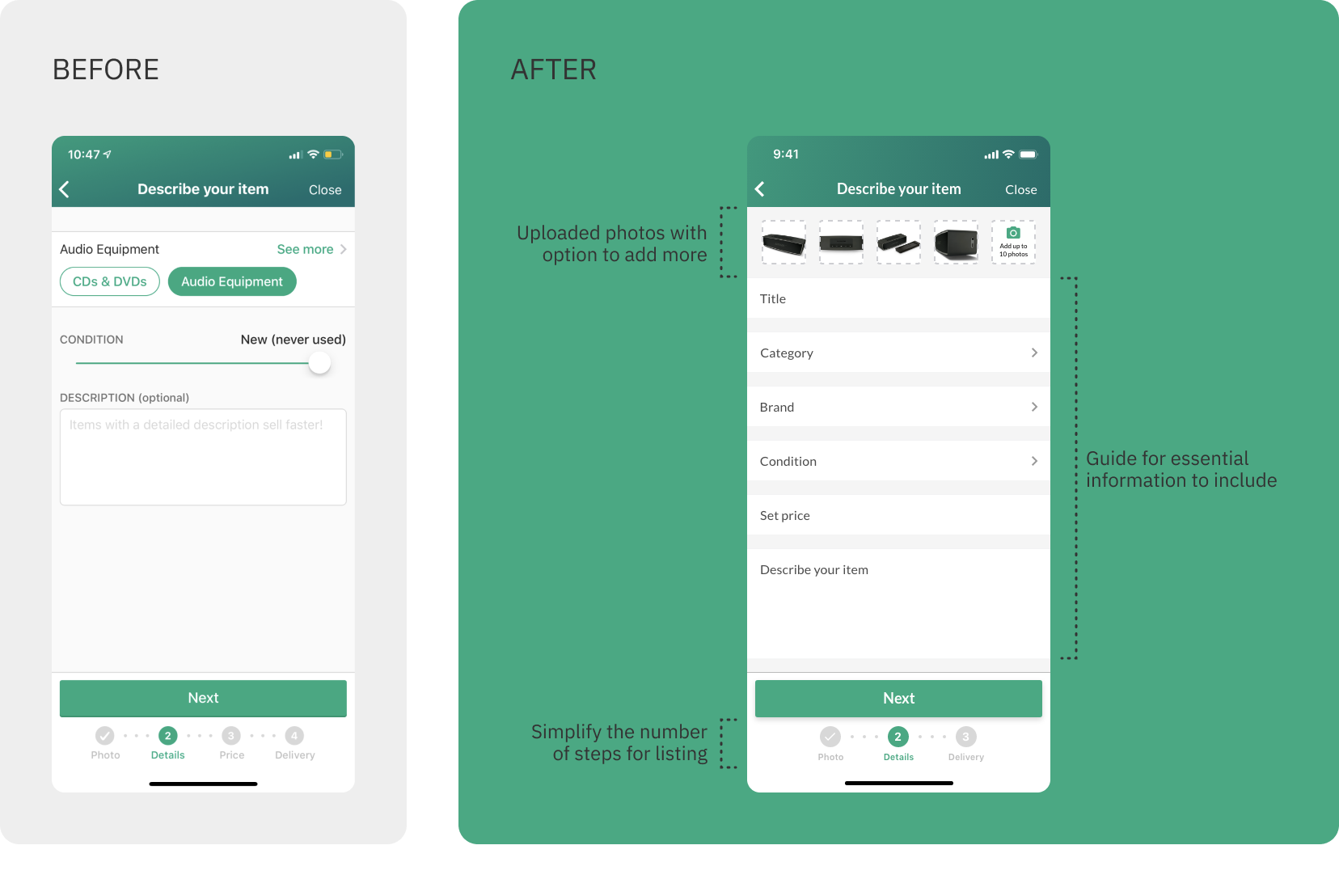
The process to list an item has been simplified from 4 steps to 3 steps. The Details page features a guide for sellers to list all the necessary information for buyers to understand and make a purchase decision. This also makes the listings in this marketplace more consistent on providing the basic details.
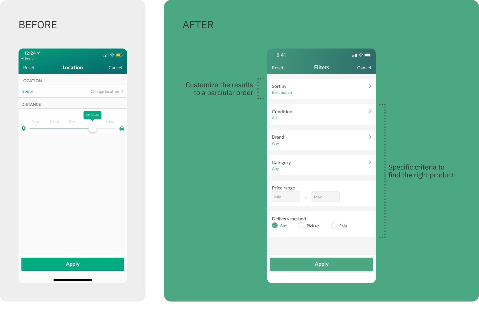
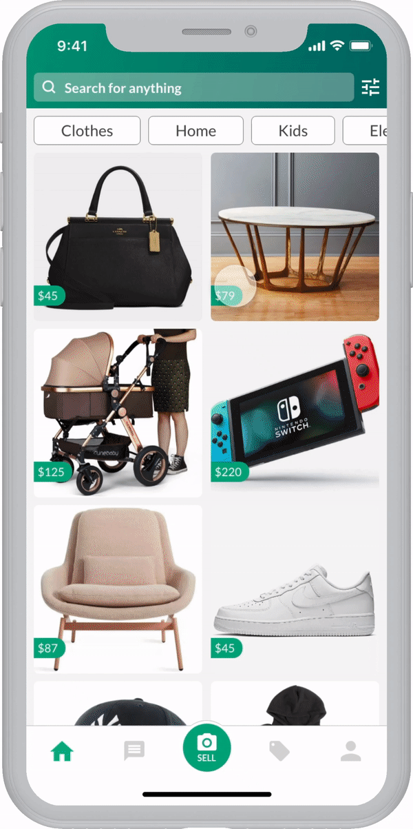
The current design doesn't have a proper feature to organize and filter search results. This redesigned version integrates the necessary information for listing an item. These advanced criteria can help buyers quickly find desired items to encourage searching and increase transactions on the platform.
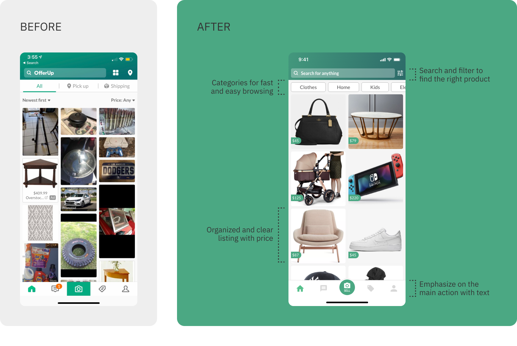
In the redesigned home page, the portion above the listings are organized within the Filters feature. It is replaced by a quick category selection to encourage casual browsing. By arranging the listings in a clear and consistent style, in addition to showing the prices on the item, buyers are able to browse more efficiently.
I started the research by looking at the basic demographic information to build a picture of who the OfferUp users actually are. As of 2019, the majority of the user base is female adults with over $60K annual income in the U.S. These data helped segment the target audience who I should interview and conduct testing with.
Given the time restraint on this school project, I interviewed 5 users who regularly buy and sell used items online, two of which are OfferUp experts. I asked them to share their experience, pain points, motivations, and goals on shopping and selling second hand items.
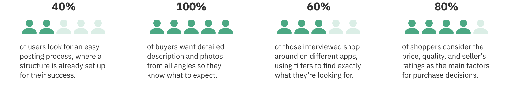
From the user interviews, the main takeaway is to standardize the information that each listing contains so that buyers are able to search and filter for the right products, then understand exactly what they're getting. This also sets sellers up for success by providing a structure to guide the process.
Here are three suggested improvements for the app:
With these research findings, I came up with 3 different scenarios and task flows that seek to improve the user experience on the app. I conducted user testing with the low fidelity wireframes to gather feedback and validate the designs.
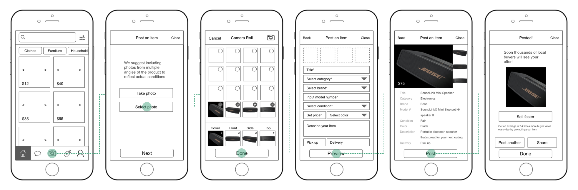
Scenario: You are inspired by Marie Kondo to declutter your home. You gathered some items you no longer need and you want to sell them online. You pull out your phone to take pictures and write a description to post on OfferUp.
Overall, users found this task to be easy and instructive. However, there were some steps that confused them:
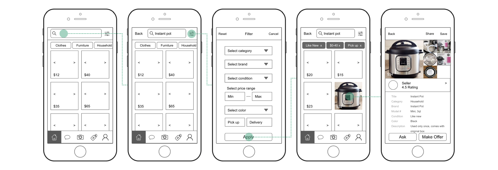
Scenario: You finally decide to buy that pressure cooker you've been eyeing for a while. You're looking for one that is in like new condition with a reasonable price. On OfferUp, you refine the listings accordingly and in a few clicks, you find the one to buy.
Users found this redesigned searching process more efficient because they are able to find exactly what they're looking for. Some pain points include:
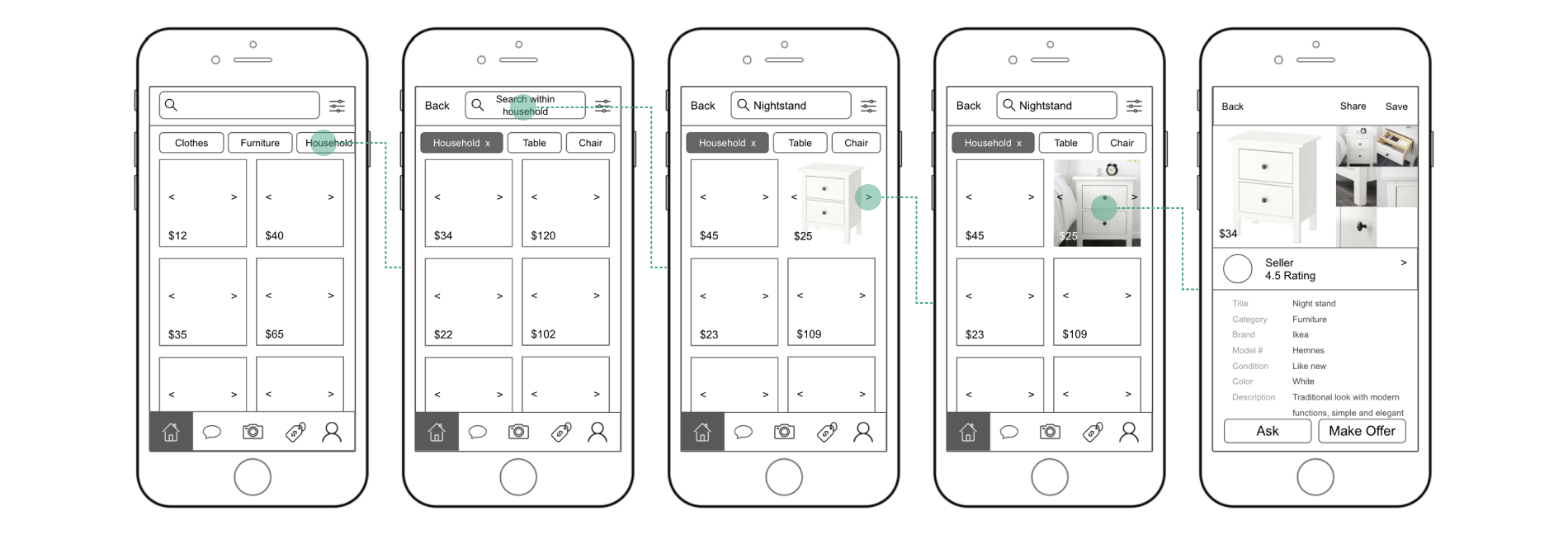
Scenario: You came across a nightstand idea on Pinterest that would be perfect for your room. You couldn't find a new one in your budget so you decide to buy a used one to DIY. You look on OfferUp and quickly find a reasonably nightstand that would work.
In this task, users found the browsing process to be quite intuitive. They were able to figure out how to achieve their goals easily. Some minor changes that could make it even better:

A step-by-step form to guide sellers on the important information to include in their listing.
Precise filters for buyers to narrow down search results for more efficient discovery experience.
Convenient category selection with quick view of price and photos before clicking into a listing.
A step-by-step form to guide sellers on the important information to include in their listing.
Precise filters for buyers to narrow down search results for more efficient discovery experience.
Convenient category selection with quick view of price and photos before clicking into a listing.
This is a hypothetical project aiming to improve the searching and listing process for used items. If I were to launch this redesign, I would look at the following metrics to measure the success of my designs.
The first metric to evaluate is if a complete item description leads to more offers. A major improvement in this redesign is providing a guide for sellers to thoughtfully describe their items. Users said that they want to know detailed information about the product so they know what to expect. If sellers are able to provide these details, then buyers are more likely to make an offer.
Another way to measure success is by looking at the number of users, search times, and items. If the number of searches increase and listings decrease, that means users are finding items more efficiently and making more offers. In addition, an increase in the number of users implies that they are able to find desirable items easier and faster, which attracts new users to join this marketplace.
The designs in this proposal may not vary greatly from the original, but the user experience has improved tremendously. It is important to focus on the users and understand their goals to solve their problems. In addition, it was helpful to use A/B testing to see how users respond to different designs for the same purpose.
Since I picked an app that I was familiar with, I had to keep reminding myself to adopt the mindset of a beginner. In the beginning of the research, I found myself making assumptions of why and how users felt certain ways. By taking a step back and listening to what they're saying, I was able to concentrate on the people I'm designing for and define the problem.
In this project, I found the problem that buyers and sellers are facing is actually related to each other. By providing a structure for sellers to list their items, I also create a better experience for buyers to filter by specific criteria and understand the details of a listing.
Since users like to shop around for the best deal, I want to explore ways to suggest similar products on the product details page. This gives buyers more flexibility and confidence in their purchase, while encouraging sellers to provide high quality photos to attract buyers.
In the user interviews, some participants said they have trouble getting a response from the sellers. I'd like to include this feature so that buyers have a better idea of when to expect a response. In addition, it'll drive sellers to respond more quickly to maintain a status.
From the user research, a seller mentioned that she wants to include pick up instructions so that buyers can come prepared to avoid wasting time and energy on both parties. It's a very constructive feedback since OfferUp started as a local marketplace, which means most products are furnitures or other heavy objects.